Responsive website design makes a web page responsive to a user’s behaviour and environment based on platform, screen size, and orientation. Responsive web design (RWD) is about more than adjustable screen resolution and automatically resizable images. It is about a new way of thinking. The content, performance, and design are essential to ensure usability and satisfaction across all devices because new devices are being developed every day.

The Layout of The RWD
The layout of RWD uses the features of fluid proportion-based grids, flexible images, and CSS3 media queries, and all three features allow designers to craft responsive websites.
- The fluid-grid concept calls for page-element sizing to be in relative units (percentages) instead of absolute units (pixels or points).
- Flexible images need to be sized in relative units to prevent them from displaying outside of their containing element.
- Media queries (@media) use different CSS style rules based on the properties of the user’s device, whether the user is on a computer, laptop, tablet, or mobile phone.

The <meta> Element
To make web pages responsive, you have to add the <meta> element in all your web pages. The element will set the viewport of your page, which will give instructions for the browser to control the dimensions and scaling of the page. <meta name=”viewport” content=”width=device-width, initial-scale=1.0″>, by setting the viewport to 1, it overrides the default to resize images proportionally.

Responsive Images
The image will fit any browser size and scale up and down when the CSS width property is set to 100%. The image can be scaled to be larger than its original size. img { width: 100%; }. The solution is to set the max-width property to 100% as long as no other width-based image styles override this rule. img { max-width: 100%; }.

Media Queries
Media queries can be used in a couple of different ways using the @media rule, and it is recommended to use the @media rule inside of an existing stylesheet. Each media query may include a media type followed by one or more expressions. The common media query types are all, screen, print, etc. The media query expression may include different media values and features to be either true or false. When the feature and value are true, the styles are applied, but if it is false, the styles are ignored. @media screen and (min-width:320px) and (max-width:1024px) {….}. The features of min-width and max-width help build responsive websites equally on all devices.
Many CSS frameworks can create RWD. Bootstrap is one of the popular frameworks, and it uses HTML, CSS, and jQuery to make responsive web pages.
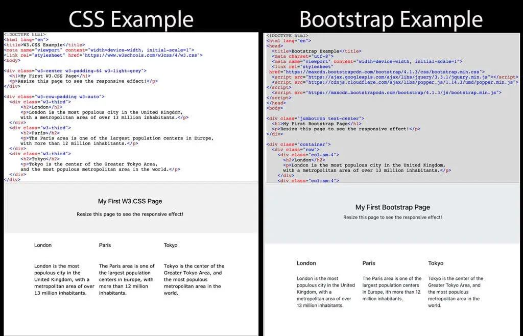
The Difference Between Bootstrap and CSS
Bootstrap is a free, open-source CSS framework, and it focuses on simplifying the development of instructive web pages. CSS stands for Cascading Style Sheets, and it describes the elements of HTML and how to present them on the web page.
Responsive Bootstrap uses a grid system that can create a page layout through a series of rows and columns. Once Bootstrap is added to a project, it provides basic style definitions for all HTML elements. The advantage is that it can also be customized through CSS classes to customize the appearance of the contents further. On the other hand, CSS has no grid system, and the code needs to be written from scratch.
Bootstrap creates responsive designs that are more attractive, while CSS develops presentable web pages. Both Bootstrap and CSS help to build presentable user interfaces.