The psychology of colour is the branch of study of how our brain perceives what it visualizes. Colour psychology is an exciting part of the complex working system of our mind, but there are still many scientific questions that are unanswered about it.
The colour impact we have on our mind is used to manipulate our decision making by multiple aspects of our society. Every human has different emotions attached to a specific colour.
Some colours give us serene feelings and tranquillity; these usually lie within the blue side spectrum of colour and are known the cool colour side; others bring fury and make us uncomfortable these lie within the red side spectrum of colour and are known for the warm colour side.
Colour psychology is an essential tool used by artists, different designers, and as a marketing instrument for many industries. Colour has a different meaning when it comes to cultural value.
Using Colour Psychology to Inspire your Brand
Look around you, colours surround us, and they are everywhere. Colour breaks down white light. That means the separation of light at different wavelengths and each wavelength is perceived as a separate colour. Objects tend to absorb or reflect these wavelengths, so when you see blue, it is the blue wavelength that is reflected while all other pigments or colours are consumed.
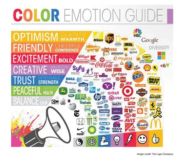
Colour plays a vital role in how your brand is perceived. Colours psychology can help build a strong and reliable brand. Whatever your brand is, it depends on your target audience and how to connect and strengthen their trust, and the colour you choose for your business can have a significant impact on your audience and your business successfulness. Colours can draw your customers or drive them away.
But, you don’t always have to follow the guidelines or the rules about the colour meanings to represent your brand and what your customers require. Just pay attention to any region colour symbolism to avoid distancing your target audience because colours can carry a different meaning in one environment primarily cultural perceptions that play an active role in dictating colour relevance for gender and which it can influence individual choices.
Colour psychology is
precise and they have universal meanings associated with different colours.
It’s the emotion, mood, and appearance that your brand creates that play a part
in inspiration.
Be sure to recognize those colours only when they come into play to match a
brand’s desired personality.
Different Colours Overview
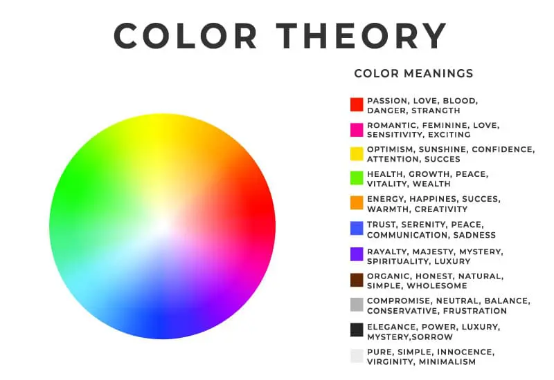
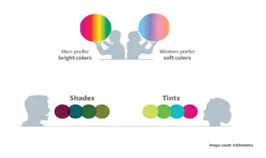
The colour psychology is specific and there are fairly universal meanings
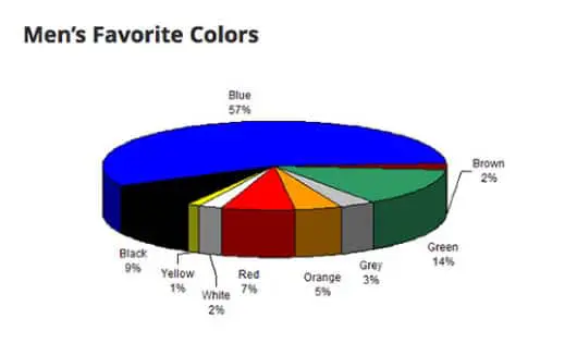
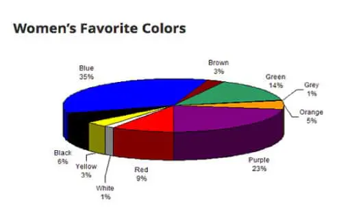
associated with various colours. Women tend to like soft colours and are more
receptive to tints. They mostly like the colours blue, purple, and green, and
the most disliked colours by them are brown, grey, and orange. Men tend to like
bold colours, and more likely to select shades of colours. The most liked
colours by men are blue, green, and black, and the most disliked colours by
them are brown, orange, and purple.
Blue – Productivity, tranquility, and trust
Blue is the most commonly used colour in today’s websites and branding. Banks and businesses select it to communicate security to clients. Most genders favour it.
Blue is famous for finance, technology, airplane, energy, health care, and agriculture.
Brands that use it:
Green – Growth, nature, and harmony
Green is often associated with growth, also is a calming and relaxing colour. It is favourably used in store to make customers relaxed. Green is also used for environmentally and friendly brands, and it’s a popular choice for giving the perception of wealth.
Green is famous for energy, food, household, finance, and technology.
Brands that use it:
Red – Life, excitement, boldness, urgency and passion
Red builds urgency and raises the heart rate; that is why it used in clearance sales or fast food outlet. It works well when you want movement and excitement. Red is the most ultimate emotional colour.
Red is famous for food, transport, technology, and agriculture.
Brands that use it:
Yellow – Joy, intellect, and energy
Yellow is most associated with food, and it is warm and cheerful. It is most commonly used by brands to evoke pleasant feelings. Yellow tends to stand out around text or background. Therefore, it can be used in branding and design.
Yellow is famous for energy, household, and food.
Brands that use it:
Orange – Ambitious, enthusiasm, and confident
Orange calls to action for selling, buying, or subscribing. It is warm and exciting as is the colour red but somewhat less aggressive. It conveys confidence and stimulates the logic center of the brain. Orange is thought to be an innovative and youthful colour, and it is a favourite with kids.
Orange is famous for Healthcare and technology.
Brands that use it:
Pink – Calming, appealing, charming and cute
Pink stimulates energy the same as red without being too aggressive. Pink has been used in holding prison cells to reduce erratic behaviour effectively. It encourages action and confidence, and it is associated with romance for being sensual and passionate. Pink is the colour of happiness, fun, youthfulness, excitement. Also, it represents hope, compassion, and caring.
Pink is famous for clothes, food, and Healthcare.
Brands that use it:
Purple – Wealth, power, and royalty
Purple is most often found in anti-ageing or beauty products chromatics. It can evoke feelings of
nostalgia and sentimentality. Purple reeks of wisdom, grandeur, and royalty, with a touch of spirituality.
Purple is famous for healthcare, finance, and technology.
Brands that use it:
Black- Authority, power, and elegance
Black is the most often choice for marketing luxury brands and products. It conveys drama and sophistication, professional and timeless. Black represents power, authority, strength, and has elegance when it is balanced.
Black is famous for vehicles, technology, and clothing.
Brands that use it:
White/ Silver – Perfection, sophisticated, and stylish
White is connected with coolness and cleanliness in
advertising. It conveys a sense of care and inspires creativity. It is useful
and adaptable. White combines well with other colours.
Greys represents neutrality and balance from being the shade between white and
black, and the absence of colour makes it dull. Silver is smooth perfection
while grey carries solidarity, practicality, and balance.
White/ Silver is famous for healthcare, cards, clothing, and charity.
Brands that use it: